Unit 2: Layout and Grid
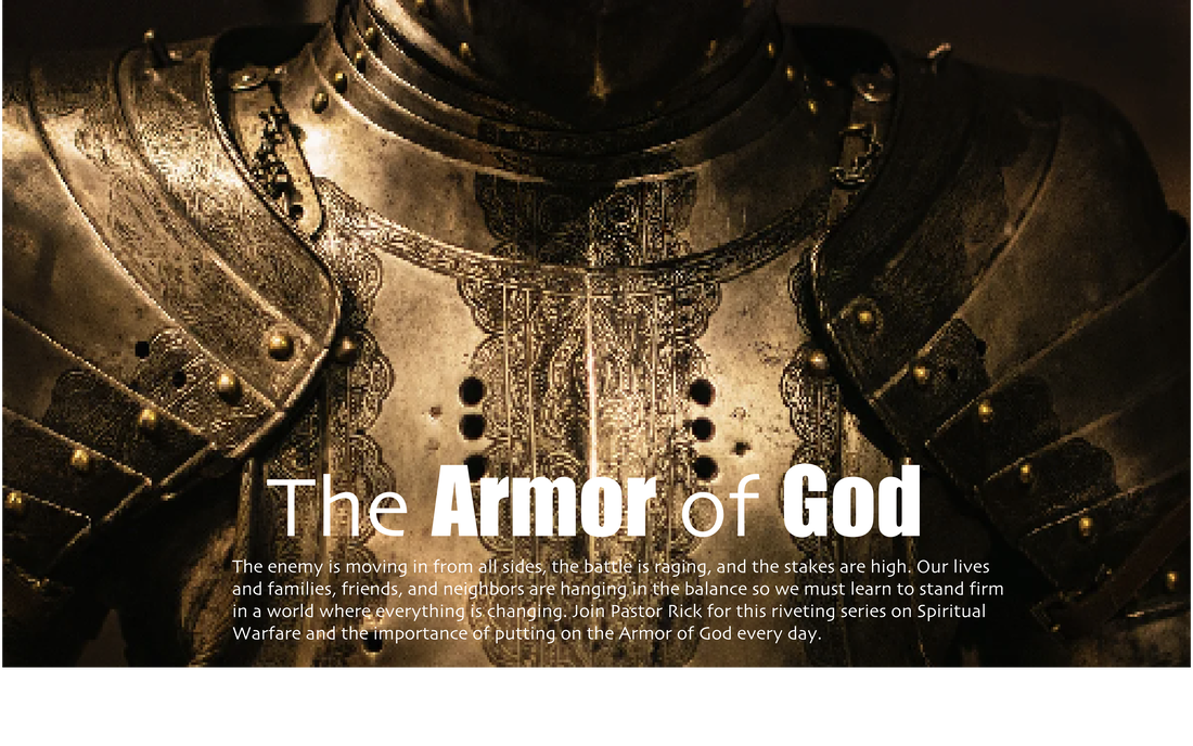
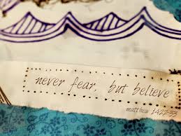
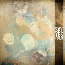
Project 2: Sermon Slide
In graphic design, a grid is a structure (usually two-dimensional) made up of a series of intersecting straight (vertical, horizontal, and angular) or curved guide lines used to structure content. The grid serves as an armature on which a designer can organize graphic elements (images, glyphs, paragraphs)
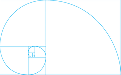
The Golden Ratio
The Golden Spiral is based on the Golden Ratio while the Fibonacci Spiral is a spiral based on the Fibonacci Sequence. Both are very similar, and can be used as a compositional tool. 
Manuscript Grid
Sometimes called a block grid or single column grid, the manuscript grid is the simplest grid structure. It’s mainly a large rectangular area taking up most of the space inside a format. 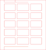
Modular Grids Modular grids are like column grids with the addition of horizontal divisions marked by rows. The columns and rows and the gutters between each create a matrix of cells or modules.
|
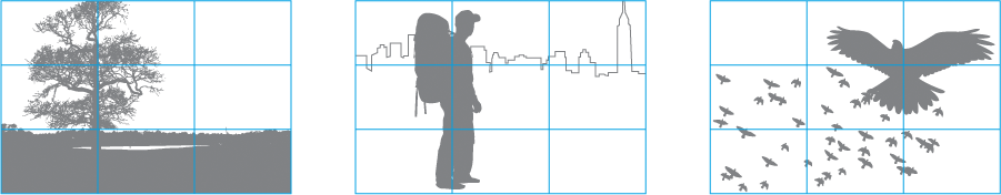
The Rule of Thirds This rule is used by professional photographers the world over. The rule of thirds works by splitting an image into thirds, so you end up with 9 equal sections, then simply place your main subject where the lines intersect.
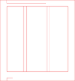
Column Grids When people think of grids, especially online, they likely think of column grids. As you would expect column grids are made up by placing multiple columns within the format.
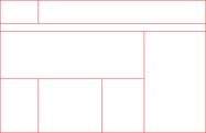
Hierarchical Grids Hierarchical grids are commonly found on the web. They’re based more on an intuitive placement of elements, which still conforms to the needs of the information.
|
- Manuscript grids — are the simplest and they work well when presenting large continuous blocks of text or images.
- Column grids — work well when the information being presented is discontinuous and different types of information can be placed in different columns.
- Modular grids — work best for more complex problems where columns alone don’t offer enough flexibility. The introduce horizontal spaces between blocks of content.
- Hierarchical grids — can be used when none of the above grids will work to solve the problem. They tend to be created organically by first placing design elements on the page and then finding a rational structure for presenting those elements.
Format The format is the area in which the design sits. In a book or magazine the format is the page. On a website the format is the browser window. The format defines the live area of a design where type, images, and other media are present.
Margins Margins are the negative space between the edge of the format and the outer edge of the content. The proportions of margin help to establish the overall tension (or lack of tension) in a composition. The smaller the margin the more tension is created. Larger margins create more white space and help focus attention on the positive space of the design. Larger margins also help the eye find a place to rest and can be a good area to place subordinate information.
Flowlines Flowlines are horizontal lines that break the space into horizontal bands. They can be used to help guide the eye across the page and can be used to impose starting and stopping points for text and images to be aligned. When elements are aligned to the top of a flowline it’s called a hang line as the elements appear to hang from the line. Type is often aligned to a series of flowlines equally spaced down the page called baselines. The base of the type sits on the line, hence the term. Aligning type to a baseline can help establish a vertical rhythm in a design.
Modules Modules are individual units of space that are separated by regular intervals. Modules are the basic building blocks of grids. When repeated they create columns and rows. Ideally the width of a module will be based on the measure of a line of text. The height would be based on some multiple of the type’s leading or line-height. The upper left corner of a module is considered to be the active corner and the lower right corner, the passive corner.
Spatial Zones Spatial zones are fields of adjacent modules. Each field can be assigned a specific function within the design.
A long horizontal field might be used to place long horizontal images. A long vertical field might be used for long blocks of text. A large rectangular field might be used for video.
Columns Columns are vertical bands of modules. There can be any number of columns in a grid. More columns leads to more flexibility, but can also make the grid difficult to work with. Column widths can be equal or they can vary across a grid.
Rows Rows are the horizontal equivalent of columns. Online it’s harder to plan for rows as the height of the format is often inconsistent and dynamic. On some pages your design may call for a fixed height, though on most pages your design is allowed grow vertically with the content.
Gutters Gutters are the spaces separating modules either vertically or horizontally. Typically we think of gutters as the space between columns, but they are also the space between rows. The minimum width or height of gutters should be an ‘em’ though this should usually be larger to better separate columns from columns and rows from and rows. The height of horizontal gutters should be based on the leading or line-height of the type.
PROJECT 2.1 Learning THE GRID
MORE ON THE GRID
Design a Sermon Slide in Illustrator that is built on a grid of your choice.
MORE ON THE GRID
Design a Sermon Slide in Illustrator that is built on a grid of your choice.